Re-drawing the Drawer
Despite it being a central navigation element, Feedpresso's navigation drawer did not change much since the launch of the app in February 2015. Here's the drawer a month ago:
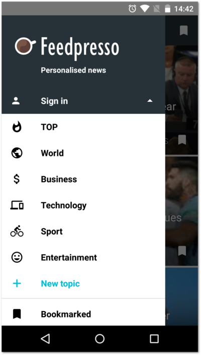
It's all about topics
The layout here is built around a feature we call topics. When users open Feedpresso, they can easily switch between pre-defined or custom groupings of news feeds, depending on their momentary interests. Besides the sign-in controls, the drawer had an accented action entry for creating new topics, and a Bookmarked entry at the very bottom for accessing saved articles. But the main purpose of the drawer was to switch between topcis easily.
This topic-focused menu layout made perfect sense when we designed the app. We were pretty stoked to give our users the ability to group news sources in their app in any way they wanted. There was just one catch: nobody else cared.
At the very top of its screen hierarchy, Feedpresso has the All stories screen. This is a section of the app where all stories from all of the topics are aggregated together. We treated All stories as a default, 'first' view of the app with the expectation that our users would spend most of their time in a particular topic. We were so sure of the topics feature we didn't even give All stories a menu entry. And oh boy, were we wrong.
As it turns out, most of our users keep coming back to Feedpresso for the All stories screen. For many, the single biggest advantage of our app is its simplicity -- no interest selection, no switching between topics -- just open up and read. From our metrics and after talking to our users we realized that the feature we had considered a filler is actually a killer (ha!). And that for many of our users, the topics are not all that important.
It's all about all the topics
Here's how we incorporated this newly-attained knowledge into the current navigational drawer launched 2 weeks ago:
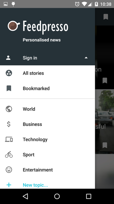
In this layout, we added an entry for All stories and moved the Bookmarked section to a more prominent place. You may also have noticed that the drawer looks more spatious: we followed the material design guidelines to adjust our icons and typography. Same number of entries, yet much more breathing space.
The topics are not going away but we have started treating them as less central. We would like our users to discover and use the feature, but they should be able to use Feedpresso without it.
Usage data and user feedback are crucial for shaping Feedpresso. It's easy to put the Steve Jobs hat on and just follow your intuitions, but nothing beats a good-old data-driven reality check.